Monday, April 23, 2012


This was another assignment we had in our 2-D art class, we had 5 tones we could use then we cut those tones out to make a self-portrait.
This was done in my Drawing one class, it was done really fast. I am not extremely good at these yet but I am learning :)

Face Card Assignment

This is an assignment we had in my 2-D art class, we had to select some sort of theme and then make face cards with it, I chose Vikings because they are AWESOME, it was fun making up the characters, I don't have pictures when they are all colored but here are the drawings,


Sunday, April 22, 2012

Oil (Fruit Still Life) When I got home I had to do one more still life for my portfolio in order to be eligable. So I set up some fruit and went at it. The bad thing was I am living in Logan and all my stuff was set up at home in Fielding a 20 minute drive. So I had to come home every weekend to work on it. Needless to say melt like fermented juice and moldy fruit.

Paintings I did On my Mission

 Oil (White Butterfly) This was a painting I did in my mission. In my 4th area my companion's uncle died who he was really close to. The next day a black butterfly fly in our house. (In the Philippines when a black butterfly flies in your house it either means someone close to you will die or a spirit of someone close to you is in the room.) So in sort of a joking way he said, to the butterfly "leave me alone you've already done your business" the next day we found out that his niece and nephew had died in a tragic house fire, it was really hard on him, their bodies were found burnt with the boy holding his younger sister in his arms trying to protect her. So I bought some paints and every p-day I worked on it. I didn't have much as far as references go. So I had to make up a lot of it in my head. Right before he went home I gave him the painting and told him to give it to his sister. She loved it!

I had a ukulele on my mission and I decided to start painting it so this is what I did.
 This is a Design I did for the Basketball team on a pillowcase

 This is the first Graphic Design I did for our youth conference.

 I did this design for the student council T-shirt.

This was a design I did for the tough club an anti drug club, I used Chris Farley for the design from his skit as the motivational speaker.
This was a Design I did that was selected for the Glass etching on the front of the new Bear River High School


Oil (Come What May) This Painting I did for my girlfriend Cami right before I left on my mission, her favorite color is Purple so I sort of had this purple hue going on. I took the picture of the background in Logan Utah and then the picture of her was taken randomly. The name of the painting was from the talk of Joseph B. Wirthlin Come What May and Love it. This was the last painting I did before I left on my mission. She entered it in the Box Elder County Fair for me while I was gone and I won some sort of prize I can't remember. But all in all I was pleased with it

High School Portfolio: Breadth

Oil (lil' Cove) This was the first oil painting I ever did

 Colored Pencil (I'm thinking Amish) this was an assignment we had in commercial art where we had to take a famous piece and incorporate some sort of advertisement.

 Acrylic , this was a simple assignment we had in high school to paint a pop can, we ran out of canvas so I used some old fabric from a pair of jeans,
 Acrylic, This was an assignment we had in high school. It was some sort of artist's style I can't remember who but It was pretty much a basic block and shade style

 Colored Pencil, This was an assignment in high school where we had to take a picture of someone and change the hue of their skin and do the shading according to the new color.

 Chalk Pastel, Another High school assignment
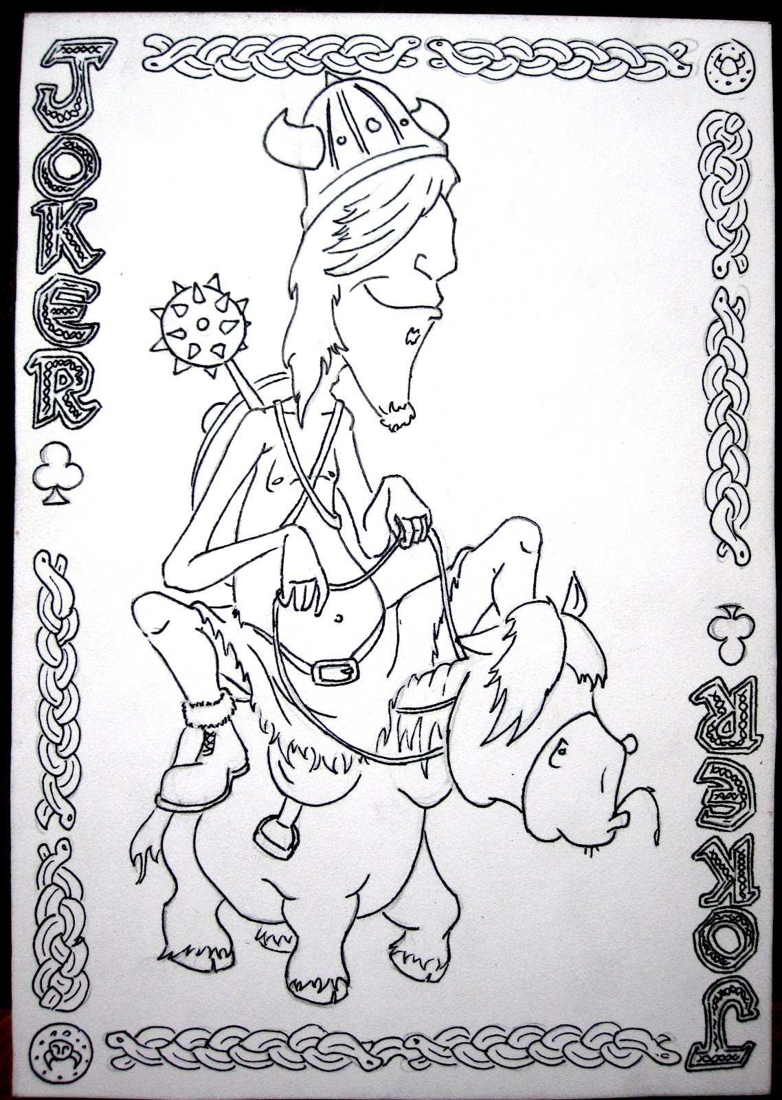
 Graphic, I think I might have been a Sophmore in high school when I did this

 Colored Pencil, I was a Freshman in high school

 Watercolor, This was the first water color I tried

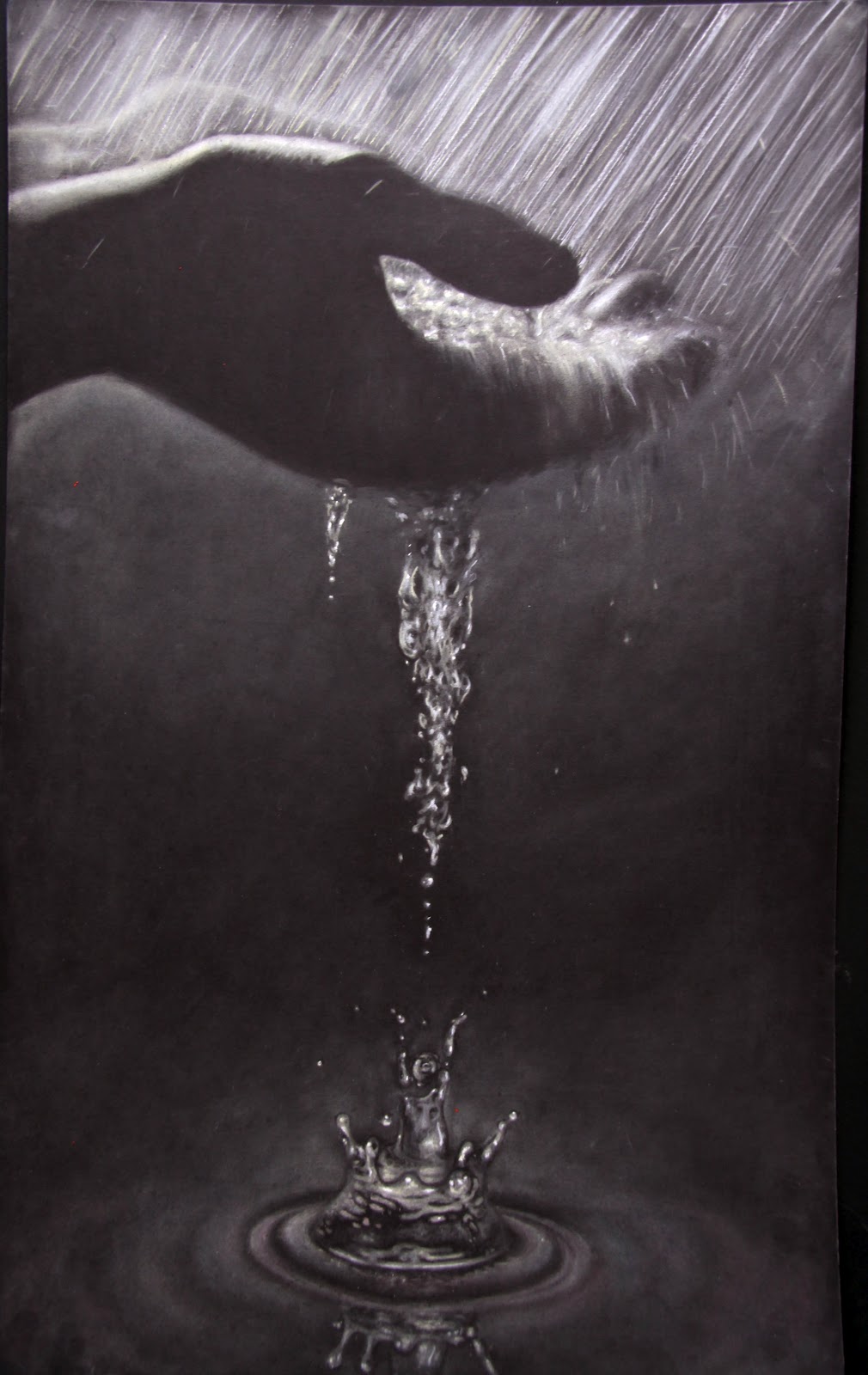
 Chalk Pastel (Lady in the Water) This one was fun to do, I did it on a black matte board. Its was supposed to sort of symbolize certain 3rd world countries where fresh clean water is scarce while we often take it for granted. See if you can figure out why I named it lady in the water.

 
 Oil, (self-Portrait) This was sort of my High school pride and joy, its almost 5 feet tall (I always wanted to try a big painting) and before you go on thinking I am all vain you should know that this one took me 16 months to do so after that I didn't have any more time to do big ones haha. I won  some awards for this one including Master's award at the Springville Art Show, 1st place at the Brigham 2 county Art competition, 1st place sweepstakes award at the Box Elder County Fair, People's Choice award at Box Elder County Fair, and Popular award and the Utah State Fair. the only problem now is I don't know what to do with it.
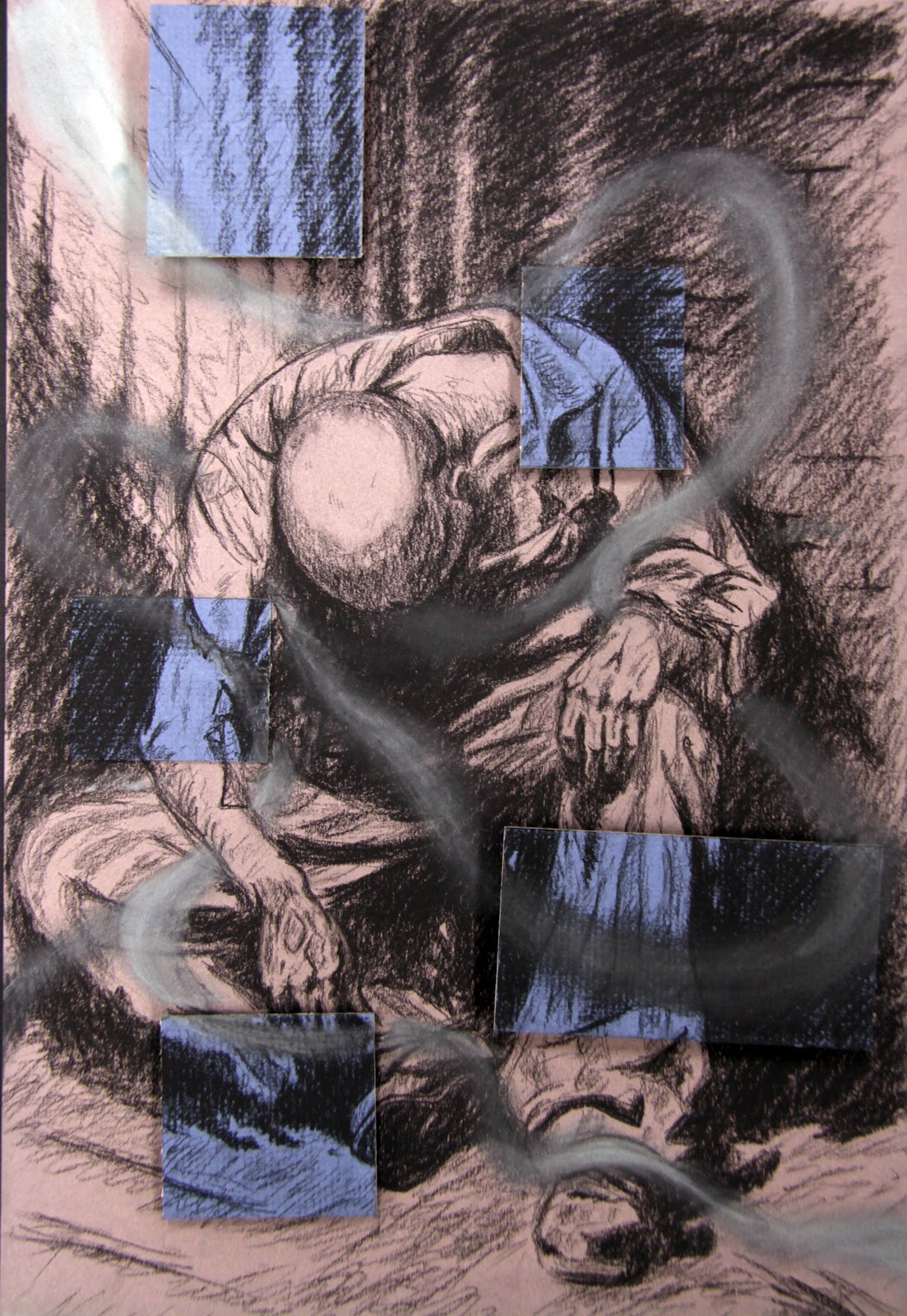
Charcoal, a simple sketch

High School Portfolio: Focus

Here are some of my first pieces in High School When I had to create a portfolio for A.P. art. Some of them I did as a senior then some of them I did previously as a freshman, sophmore and Junior. In our portfolios we had to have 24 pieces 12 breadth that show the variety of things you can do and then 12 focus, 12 pieces with a common theme. Mine was Design that represents certain emotions and feelings. It wasn't the best and most organized but I had fun doing it.

 Oil, (Hope) this one I just painted out of my head, a lot of people asking me if that kid is me....well its not haha I guess it can be if you want it to be but the idea was even amidst destruction and corruption in our world there is always hope. The kid represents the younger generation looking at the world ahead of him but despite the termoil there is still beauty hence the sunset and the blossoming tree behind him. I used yellow for the color of the designs meaning that hope is bright

 Watercolor (Relaxation) in high school I hated doing watercolor but it seemed to be the right choice for relaxation since it has such a relaxing look.

 Oil, (Determination) I used a Dancer in this one to show determination and how when one is determined they sort of lose themselves in their work. Hence the design. Fun Fact, I needed to finish this one as my last piece in order to send in my portfolio, so I pulled an all nighter and finished it in one night, we then sent it in to the Brigham art show and I ended getting first place. I slept so good the next night :)

 Charcoal (Depression) This one I wasn't too pleased with when I was finished but it is what it is. It is supposed to be how Satan entangles us in his unseen traps, The man in the picture is in prison clothes none of his face is visible and I was pretty pleased with the design. Until I decided to get a little creative and add these blue squares that popped off the picture. It was a valiant effort though.

 Ink (Pain) I felt like this one could have been stronger. Maybe a deeper red or thicker designs I don't know I like the rest of the picture the stippling turned out great for what I was going for. But the Design itself just isn't doing it for me.

 Oil (Anger) not much to say about this one except my mom didn't like me to hang it up in my room.
 Oil (Love) I liked how this one turned out for the most part, I feel like the red designs turned out pretty cool, I ended up sharpening up those black edges.
 Chalk Pastel (spirit) This was a desperation piece so I could finish in time, ya I'm not too proud of it but it was part of my portfolio. The idea had potential.

 Colored Pencil (Creativity

I decided to start doing a blog because my sister Kayela and my brother Jared were using them to post their Art. So I decided to post up some of my art and sketches and what not. I do sell my paintings so if you have any questions or know someone who might be interested just contact me on my email. also if you have any suggestions for me, if you know of any contests or know of other cool blogs I could check out just let me know.