Here are some of my first pieces in High School When I had to create a portfolio for A.P. art. Some of them I did as a senior then some of them I did previously as a freshman, sophmore and Junior. In our portfolios we had to have 24 pieces 12 breadth that show the variety of things you can do and then 12 focus, 12 pieces with a common theme. Mine was Design that represents certain emotions and feelings. It wasn't the best and most organized but I had fun doing it.
Oil, (Hope) this one I just painted out of my head, a lot of people asking me if that kid is me....well its not haha I guess it can be if you want it to be but the idea was even amidst destruction and corruption in our world there is always hope. The kid represents the younger generation looking at the world ahead of him but despite the termoil there is still beauty hence the sunset and the blossoming tree behind him. I used yellow for the color of the designs meaning that hope is bright
Watercolor (Relaxation) in high school I hated doing watercolor but it seemed to be the right choice for relaxation since it has such a relaxing look.
Oil, (Determination) I used a Dancer in this one to show determination and how when one is determined they sort of lose themselves in their work. Hence the design. Fun Fact, I needed to finish this one as my last piece in order to send in my portfolio, so I pulled an all nighter and finished it in one night, we then sent it in to the Brigham art show and I ended getting first place. I slept so good the next night :)
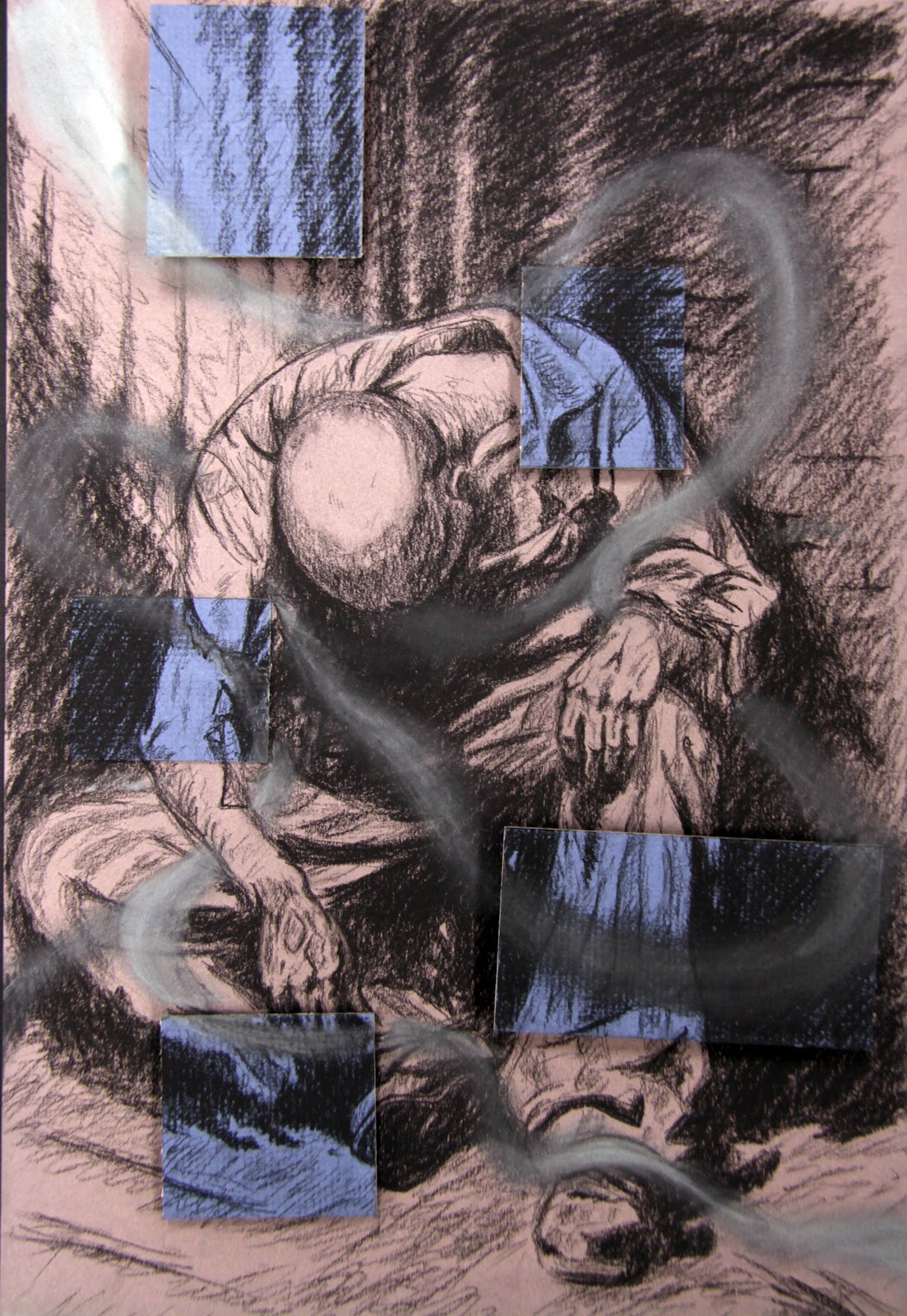
Charcoal (Depression) This one I wasn't too pleased with when I was finished but it is what it is. It is supposed to be how Satan entangles us in his unseen traps, The man in the picture is in prison clothes none of his face is visible and I was pretty pleased with the design. Until I decided to get a little creative and add these blue squares that popped off the picture. It was a valiant effort though.
Ink (Pain) I felt like this one could have been stronger. Maybe a deeper red or thicker designs I don't know I like the rest of the picture the stippling turned out great for what I was going for. But the Design itself just isn't doing it for me.
Oil (Anger) not much to say about this one except my mom didn't like me to hang it up in my room.
Oil (Love) I liked how this one turned out for the most part, I feel like the red designs turned out pretty cool, I ended up sharpening up those black edges.
Chalk Pastel (spirit) This was a desperation piece so I could finish in time, ya I'm not too proud of it but it was part of my portfolio. The idea had potential.
Colored Pencil (Creativity


The dancer one is definitely my favorite. Cool contrast.
ReplyDelete